Brand
Logos, colours, typefaces and a library of backdrops. Take what you need, and keep it looking like Toden.
Logo
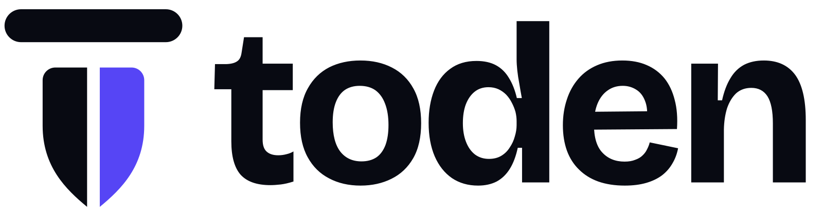
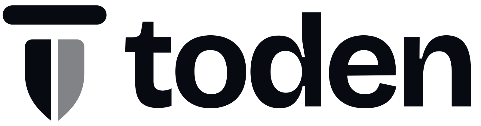
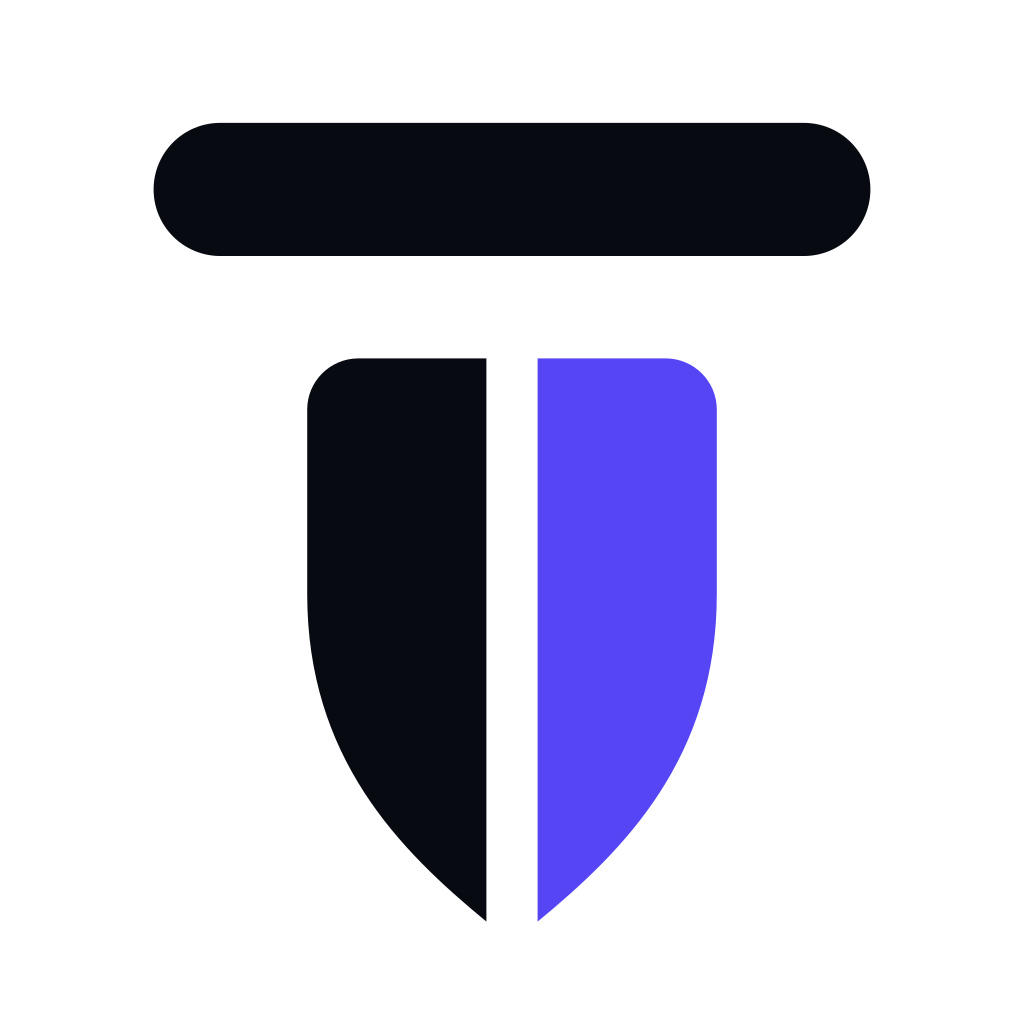
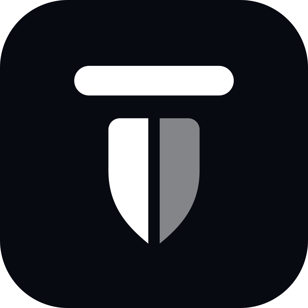
The mark is a letter T made of a bar and a split shield. Next to it sits the name, drawn in lower case. Four versions cover every background.






Colour
Most of any layout is neutral, and the purple does the pointing. Gold is for rare moments of emphasis. Select a colour to copy its value.
Purple scale
Gold scale
Typography
Bricolage Grotesque does most of the talking: headings, introductions, body copy, buttons and navigation. Geist takes over where text gets small or dense.
Bricolage Grotesque
The brand voice. Use it first.
- Verify anyone.
- Bold 700Display, page titles
- Verify anyone.
- SemiBold 600Headings, buttons
- Verify anyone.
- Medium 500Navigation, emphasis
- Verify anyone.
- Regular 400Introductions, body copy
Geist
Small and dense text.
- Verify anyone.
- Regular 400Small text, table data
- Verify anyone.
- Medium 500Labels, form fields
- Verify anyone.
- SemiBold 600Table headers, tags
16/14
The rule of thumb: at 16 px and above, set it in Bricolage Grotesque. At 14 px and below, and for anything in a table or a form, set it in Geist. Code, IDs and API keys are JetBrains Mono. All three are open source and included in the kit.
Backdrops
Four families in six palettes, each built from the bar, the split shield and the brand colours. Pick one to see it with the logo, then download it as WebP to use or SVG to edit.
Backgrounds drawn from the logo's own parts: its bar, its split shield and its colours. Showing 24.


















Using it
The guidelines cover clear space, minimum sizes, accessible colour pairings and tone of voice in full.
Please do
- Use the files as supplied, at any size above the minimum.
- Leave clear space around the logo: at least the width of one half of the shield.
- Pick the version by the background: colour on light, reversed on dark.
- Write the name as Toden, with a capital T, in running text.
Please do not
- Stretch, rotate, recolour or redraw the logo.
- Add shadows, outlines or effects.
- Retype the name in a font, or set it in capitals.
- Place the logo beside another brand's as if the two were one.
Need something that is not here?
A size, a format, a co-branded lockup or a quote for the press. Ask, and we will send it rather than have you rebuild it.